Nowadays, people browse websites using a variety of devices, including desktop computers, laptops, tablets, and cell phones. Customers can leave your eCommerce website without purchasing if it is not visually attractive or does not perform properly on various devices.
That’s where Responsive Design for eCommerce comes in.
Your website will automatically adjust its layout and content according to different screen sizes if it has a responsive design. In this blog, we will explain what responsive design is, how it works in online stores, and why it is so important. We will also share some real-life examples and tips to help you make your store better.
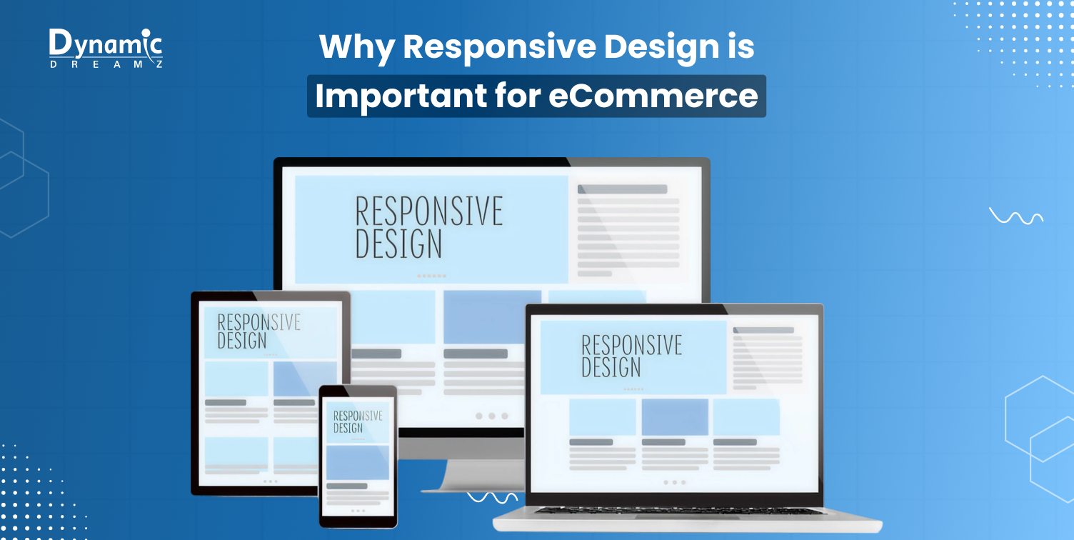
What Is Responsive Design?

Simple Definition
Your website will automatically adapt its layout and content according to various screen sizes if it has a responsive design. Whether someone is using a mobile phone, tablet, or laptop, your website will adjust itself to fit the screen perfectly.
For example:
- Images will be smaller and text will be larger on a mobile phone.
- The navigation menu may appear as a drop-down or “hamburger” menu on a tablet.
- You might see everything arranged and detailed on a desktop.
No matter whether they are using a mobile, tablet, laptop, or desktop, it makes it simpler for users to access and utilize your website with ease.
How Responsive Design Works in eCommerce
Responsive design allows sellers on the internet to display mobile-friendly menus, adjust layouts, and properly fit images into their eCommerce website. It enhances the shopping experience for all website visitors.
If customers can clearly see products, read the text effortlessly, and check out quickly on any device, they are more likely to make a purchase.
Why Responsive Design is Important for eCommerce Businesses
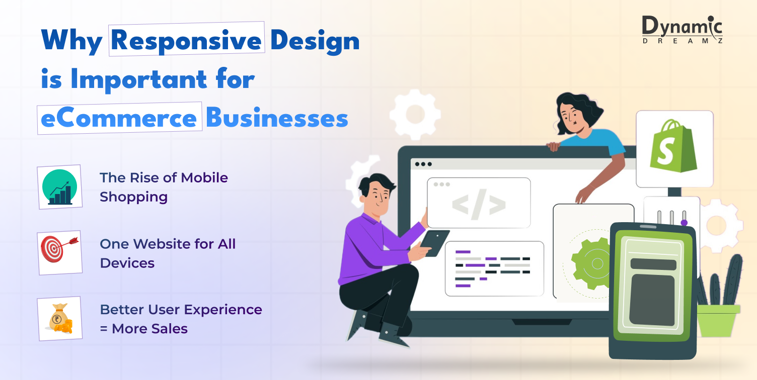
The Rise of Mobile Shopping
Did you know that over 60% of online consumers explore and purchase products using their mobile devices? People enjoy the simplicity of making purchases on their phones. If your website doesn’t look and perform very well on mobile, you’re missing out on many sales.
That’s why responsive design of your website is necessary in today’s eCommerce market.
One Website for All Devices
You don’t need to create separate desktop and mobile versions of your website when you use responsive design. One website can work on all devices. All devices can access the same webpage. Time, money, and effort are all saved. It facilitates updates as well. Want to make a responsive website for your jewelry Brand, find out Shopify themes for jewelry Brand.
Better User Experience = More Sales
A responsive website functions more effectively, loads more quickly, and looks better. All of this makes customers feel pleased and relaxed when they shop. When visitors stay longer and explore things easily, they’re more likely to buy.
Also, when websites are not mobile-friendly or not responsive, your website visitors leave quickly. It is called a high bounce rate. Responsive websites lower your website’s abandoned cart and bounce rate and increase sales.
Also Read: Shopify SEO Apps to Drive More Sales
Top Benefits of Responsive eCommerce Design
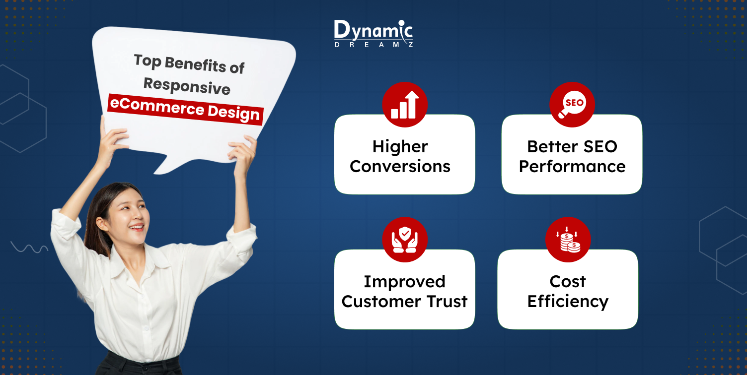
Let’s check out the main advantages of eCommerce websites that are made with responsive design.
Higher Conversions
If your eCommerce website is easy to use, people buy more. Checkout is quicker and simpler with a responsive design, especially on mobile devices. Simple and fewer steps = more sales.
Better SEO Performance
Google gives priority to mobile-first websites in indexing. It means that when ranking your website in search results, it considers its mobile version. Your SERP rank will go down if your website is not responsive. For this reason, responsive eCommerce design is essential to SEO.
Cost Efficiency
You don’t have to create and maintain separate desktop and mobile websites when you have a single responsive website that works well on every device. It saves money in design, development, and maintenance.
Improved Customer Trust
When your website looks professional and clean on all devices, customers feel that your brand is trustworthy. A good design structure builds confidence and credibility in buyers.
Key Features of a Responsive eCommerce Website
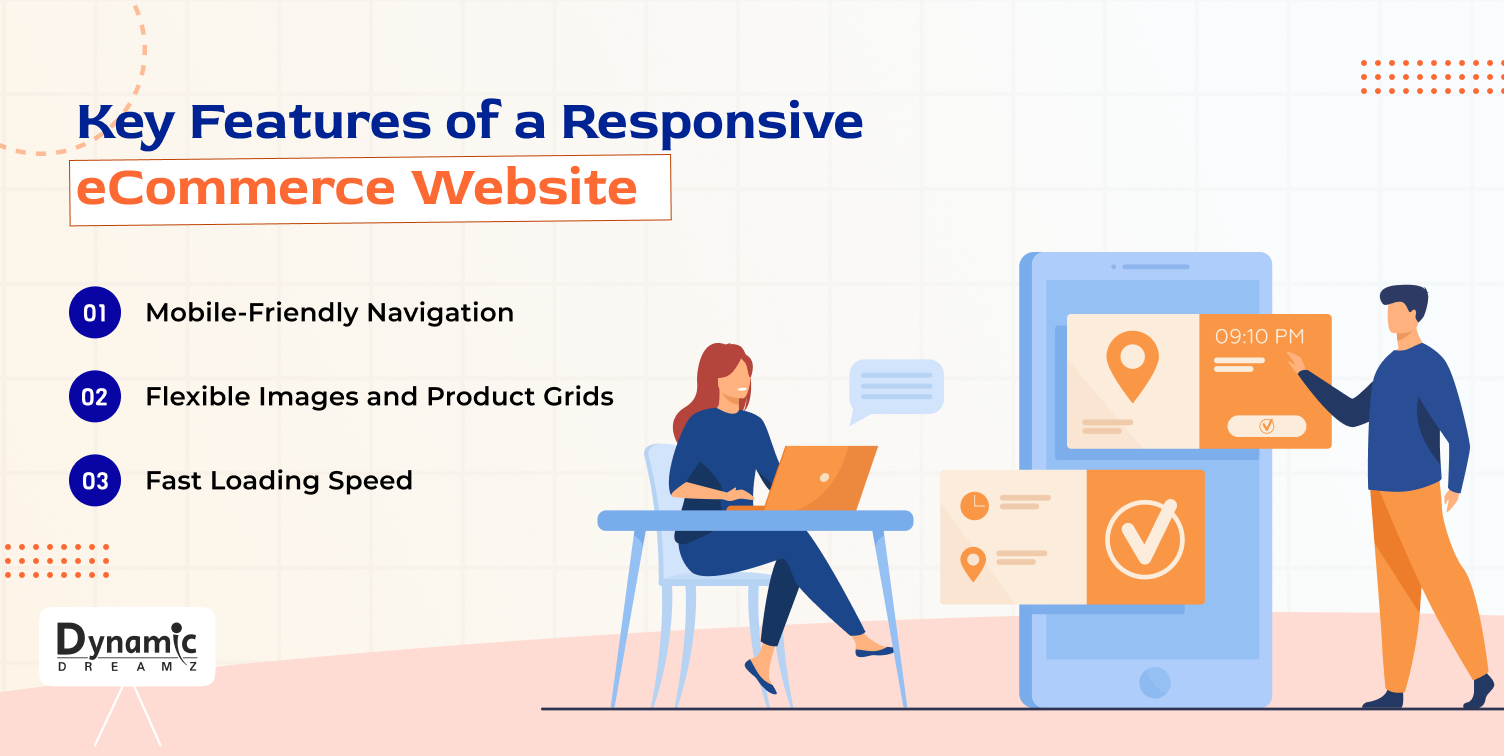
- Mobile-Friendly Navigation: Navigation menus on a responsive website are easy to tap. “Hamburger menus” and drop-downs allow users to explore a website with just one hand or thumb.
- Flexible Images and Product Grids: Product grids and photos automatically adjust to fit smaller displays. It guarantees that your website is readable and clear.
- Fast Loading Speed: Speed is super important on mobile. Heavy pages are slow to load, and people leave. A good responsive website uses lightweight images and code so it loads fast.
How to Check If Your eCommerce Website Is Responsive

Use Online Tools
To test your website, you can take advantage of free tools like Google Mobile-Friendly Test. To check how your website appears on smaller devices, you can additionally view it in a browser and change the screen size.
What to Look For
Make sure:
- The fonts are large enough to read.
- Buttons are easy to tap.
- Images are clear.
- Menus and links are working well.
Ensure that your calls to action (CTAs) are displayed on all screens and are clickable.
How to Make Your eCommerce Website Responsive

Choose a Responsive Theme or Template
If you are using eCommerce platforms like Shopify or WordPress, choose a theme that is already mobile-responsive. These themes are created to look attractive on all screen sizes. If you are a startup, you can use free themes. Once you become a big brand, you can use a paid theme.
Work With a Developer or Design Agency
If you want a custom look, you can hire a professional developer or a custom theme development agency. They can create a responsive website based on your brand and requirements. Custom theme development services can be a little costly if your requirements are too high. But they help you to get an attractive look and a responsive design for your website.
Test, Improve, and Keep Updating
It takes time and effort to create a responsive website, and it is not a one-time task. You must test it repeatedly and enhance it based on customer feedback and behavior. You can hire a developer or a website development and design agency to help you maintain and update your website regularly.
Common Mistakes to Avoid in Responsive Design

- Ignoring Mobile Speed: If your website is slow on mobile, visitors will leave without exploring your website. Avoid using heavy images, large videos, or too many popups. The simpler your website design, the faster it works on mobile.
- Poor Button Sizes and Text: Don’t create buttons too small. It can create issues with the mobile screen, and the user gets frustrated. Keep text readable without zooming, so the readers can easily read the content and won’t leave your website. Your website should be easy to use with just one hand on a mobile.
- Forgetting Cross-Device Testing: Always test your website on phones, tablets, and desktops. What looks good on one screen may not work on another because every device has a different screen size and specifications.
Real-Life Examples of Good Responsive eCommerce Design
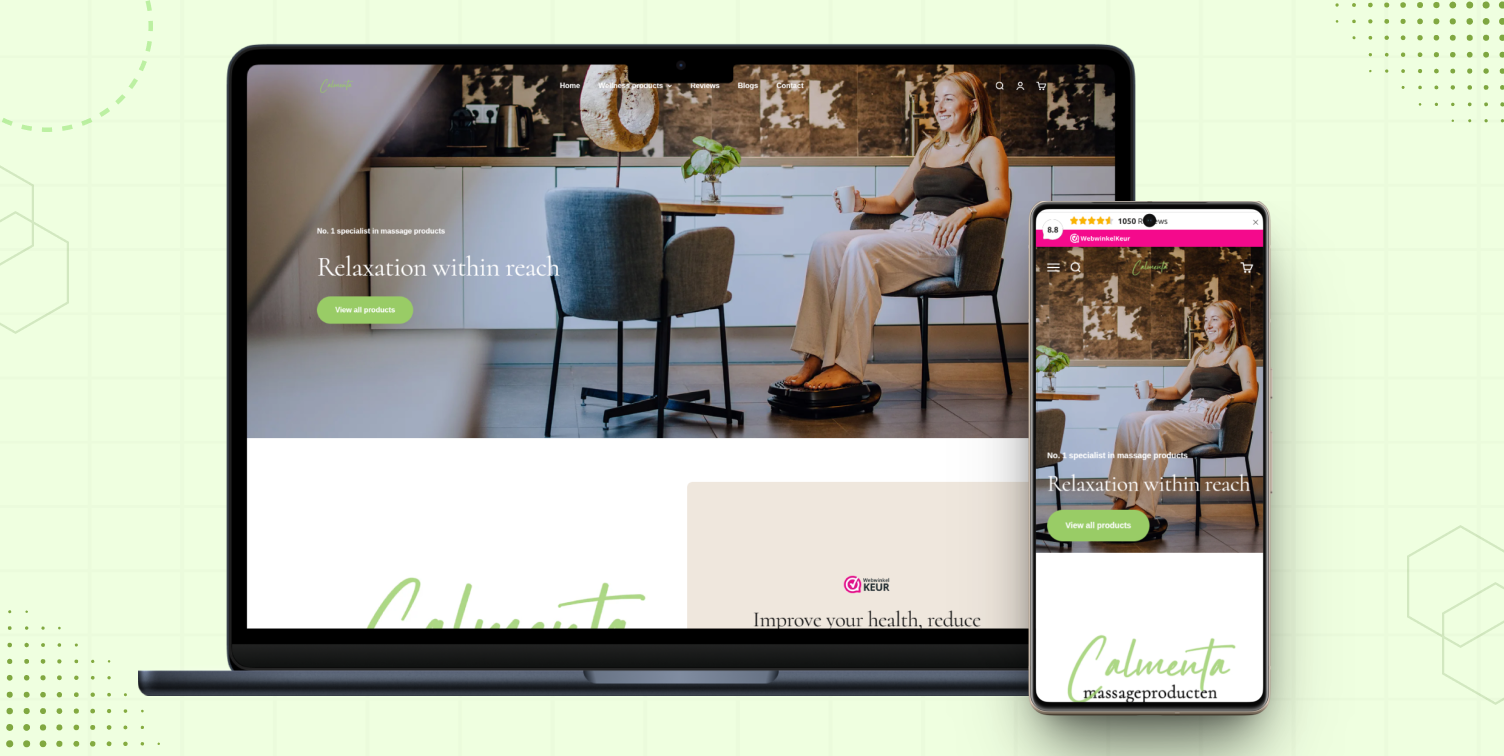
Calmenta
Calmenta enhanced its mobile design by using clean layouts and fast-loading images. As a result, customers spent more time on the website and completed more purchases.
Read More:

Holy Plantz
Holy Plantz is a plant-based food store, upgraded to a mobile-friendly Shopify theme. This enhanced user experience and reduced bounce rates by over 30%.

Trendia
Trendia made their Indian fashion store easily accessible on all screen sizes by putting in place a simple, mobile-first design. Mobile sales consequently increased quickly, particularly among younger customers.
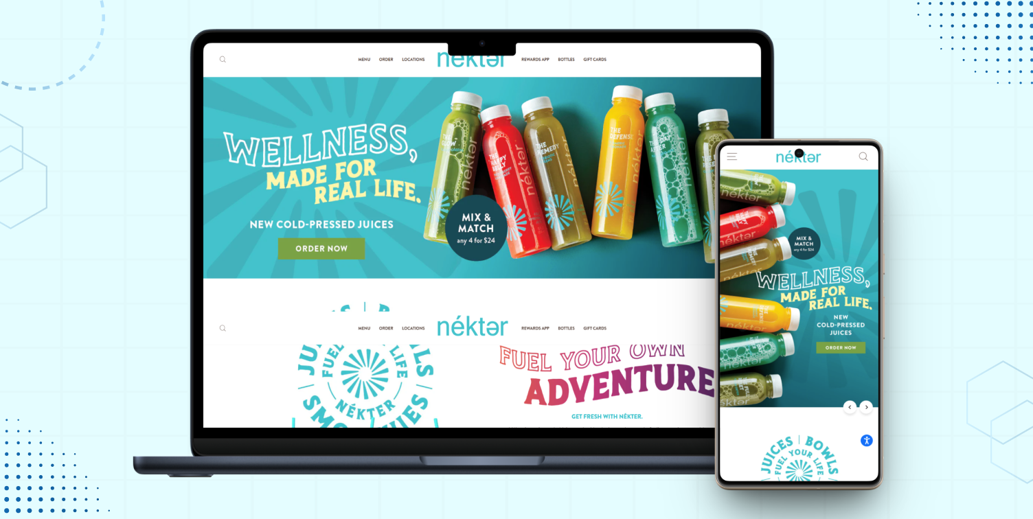
Nekter Juice Bar
This health-conscious company redesigned its website with a responsive design and eye-catching colors. Customers can now rapidly explore and order juice from their phones thanks to the new design, which increases online orders.

ConsciousPoker
ConsciousPoker created its learning platform, completely responsive, with the goal of teaching poker techniques. It allowed users to consume training videos and content smoothly on their cell phones, enhancing retention and engagement.
Read More:

Banchharams
An Indian sweets and snacks brand, Banchharams boosted its website to be responsive, making it easier for users across all age groups to order positive treats via mobile.
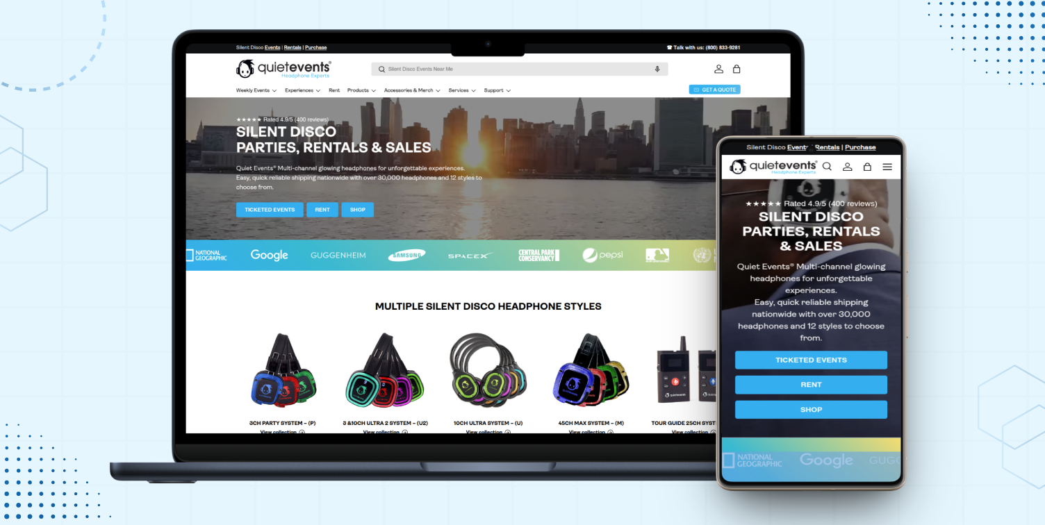
Quite Events
A platform for event management, Quite Events redesigned its website to load faster on mobile and offer simple navigation—this enhanced lead generation from mobile users.
Key Takeaways from the Examples
- A responsive design leads to better accessibility on mobile devices.
- Clear product displays and fast loading boost customer interest.
- Responsive websites provide advantages to all businesses, whether they are in the food, fashion, education, or service industries.
- More leads, conversions, and engagement result from mobile-first thinking.
- Simple design works better on mobile.
- Fast loading = better experience.
- A good design builds trust and increases sales.
Conclusion
Any eCommerce business is required to have a responsive design; it is no longer an option. Your eCommerce website needs to function flawlessly across every device because more consumers are shopping on mobile devices than ever before. A responsive website enhances user experience, increases trust, boosts SEO, and drives more sales.
If you want to grow your business, start focusing on Responsive Design for eCommerce today. We have a professional team of website designers who are always ready to help you redesign your eCommerce website and grow your online business.
Dynamic Dreamz can help you by redesigning your website or designing a new custom theme, or customizing a few sections as per your requirements. We can also integrate your preferred paid or free theme or template into your website. You have a choice on how to make your website better. Contact us with your project needs.
FAQs
What is responsive design in eCommerce?
Your website’s layout fits according to the device’s screen when you use responsive design. It allows users to shop smoothly on phones, tablets, and desktops.
Why is mobile responsiveness important for online stores?
The majority of shoppers use mobile phones. They can leave without purchasing if your website is not mobile responsive. Worldwide, over 60% of users use mobile to browse and shop.
Does responsive design affect my Google ranking?
Yes. Google checks the mobile friendliness of websites and ranks mobile-optimized websites higher in search results if your website lacks in design and is unable to perform properly on mobile and tablet devices.
How can I check the responsiveness of my eCommerce website?
You can use Google’s Mobile-Friendly Test tool or check by resizing your browser screen. Your browser provides you with an in-built tool that allows you to resize your browser screen from the maximum desktop size to a smaller mobile screen size. There are also some specific devices’ screen size options available. The paid option is also available; you can buy some online tools that allow you to test your website on every device screen size. These results are very accurate, but you have to pay a few dollars monthly or annually.
What are the benefits of responsive eCommerce websites?
Responsive eCommerce websites enhance user experience, boost sales, lower bounce rates, and perform better on search engines. You can get a chance to rank higher than your competitors on Google search.
Can I make my Shopify or WordPress website responsive easily?
Yes. Both platforms offer mobile-responsive themes and templates that are easy to use and customize. Also, you can hire a website design and development agency to help you redesign your website and make it responsive. They can also offer you custom theme development services. This option is a little costly, but you can create your website design as per your requirements.